To begin, I find the picture I like, then I trace it out. I used a composite of these pictures:


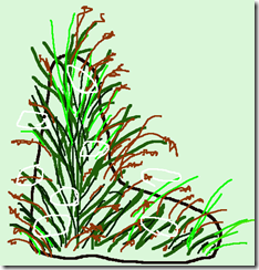
I did a rough line drawing of a blob (seriously), then I added some shooting grasses and wheat stalks. Several circles within the blob helped me to decide where to add the cow parsely. You want to see the drawing? Seriously? Here it is:
 Nice, isn’t it?! This is really the picture I used to start the process.
 Tip! I use these $1.00 Christmas lights and chuck them under my sewing table as a light source to trace the design. I use a disappearing pen (the purple kind) to make my marks. You may not see my marks, but I’m sure you can see how well these Christmas lights work as a light source..
I started freehand sewing with the darkest colour. I used a dark green in the bobbin and top—this may or may not be important to you. It depends on whether you have your bobbin thread showing on the top. I like that look, so I get a variegated look . The darkest colour defines the shape and helps to create depth as the piece evolves.

The second colour I added was a mid green on top and the same dark green thread in the bobbin. The use of a different green continues to add depth and variation in a piece. My rule of thumb is to add 3 colours at a minimum to make the piece look realistic and give that 3D quality to a piece. You can probably still see the purple markings I am using as a reference.

After the mid green colour was added, I added an acid green to give the grass some light and used the mid green colour in the bobbin. Looking better…

Finally, I added the last green—a very, very pale green with a yellow thread in the bobbin. I then took ‘stock’ of the picture (pun!) and decided that the grass was good the way it was. I then started to add the light brown wheat stalks here and there. I used the same brown in the top and bobbin. These were on the original picture in some fashion and I used the source picture only as a reference.

The final stage was to add the cow parsley. Below you can see how I add each flower head. When I finish a group, I do not snip the thread, but just lift the presser foot and move on to the next area. When I completed all of the cow parsley, I then used small, sharp embroidery scissors and snipped off the connector threat.

At this point I thought I would add a few highlights with felt markers. I had some areas where the very light green really stood out and I used a dark green marker to colour it in. Man, did I feel smart!! And it looked great when it was done. It was then that I made a FATAL mistake. I misted the piece to iron it flat and that little bit of felt marker bled from the thread onto the white background. Bled. Really. Badly. I thought I could save it by adding more grasses at the bottom of the piece. That went OK, but see the blob on the left (about halfway up)? I decided to try and paint that out ‘just a bit’ with white paint. Sheesh, just writing that I am wincing. What a disaster!

Only to you, dear readers, would I show this horrible piece. My only excuse is that it was after midnight last night and I was exhausted. I made one bad decision after another, adding more white, then a light green, then more white, etc… Here is the end result.

And a close up just to REALLY let it sink in.

At that point there was nothing—NOTHING that could have saved this piece. So I took a deep breath and started again. I decided that I needed a coloured background because white was too boring, and I quickly colour washed a new piece of fabric with a very, very light green. I cannot get the true colour to show here and it looks very yellow. But the colour looks more like the paint chip beside it, except mine is a bit lighter:


I did all the same steps as shown above and here are a few pictures of the finished piece. I finished at about 2:30am and by 10:30am it was at the shop. Tomorrow morning class registrations starts and I just got this in on time. Nothing like using every last second to work on a piece!


I’m happy with this one.. Hopefully the purple marks will disappear before tomorrow, but I cannot fret any longer. It is done. Put a fork in it..
PS—it took me 33 minutes to make the second piece. That included photos, threading bobbins and ironing.
Beautiful:) I like the coloured background. It finishes the piece off wonderfully. I'm curious as to what brand of purple pen you used. I have one that vanishes almost instantly which is so annoying. I guess it's better than one that doesn't disappear but it is sort of useless.
ReplyDeleteHi Mary Ann—Thanks for the comment! I use a pen that has a purple end and blue end. It is called Mark B Gone by Dritz. I cautiously recommend this pen—you cannot use heat or they can permanently set, although a Clorox bleach pen will take the marks right out..
ReplyDeleteIf I am washing a piece, I always use washable markers. They are the best thing ever...
Actually the far away picture of the disaster isn't that bad. I think both pieces are very beautiful. Isn't disaster the mother of invention - not quite the saying but you get my point. The disaster help push your creativity even if it didn't work and you were tired. It was very courageous of you to show your disaster and I appreciate it. I still think your work is beautiful.
ReplyDelete*9-
Why thank-you Michelle--what a nice comment! I have always admired those who show their great work and their disasters, so I decided when I started this blog to do both. There is a saying that I I have modified for my purposes: "if only the sweetest songbird sang in the forest, what a quiet place it would be." Disasters for me are opportunities to grow. Thanks for writing.
DeleteI can see why you didn't want to use the first sample for the store, but it is actually quite cool looking in the photo and I can see it looking great framed and hung. Ah the excitement of sign up day. I'm not going in, are you?
ReplyDeleteHi Janet--do I hear "Christmas Present"? (ha) Seriously no--it is worse in person. lol It is going in my embroidery book for future reference...
ReplyDeleteBeautiful! that yellow background really makes it pop. : )
ReplyDelete~Monika
Lovely work! I have been enjoying your photos. Thanks for sharing.
ReplyDelete